Services Provided:
Web Design | Branding | Presentation Design | Motion Graphics | Social Media Creatives | Creative Ads | Concept Development | App Design | Content Management | Packaging and Merch | Marketing Consulting
The Challenge
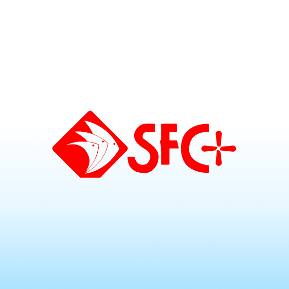
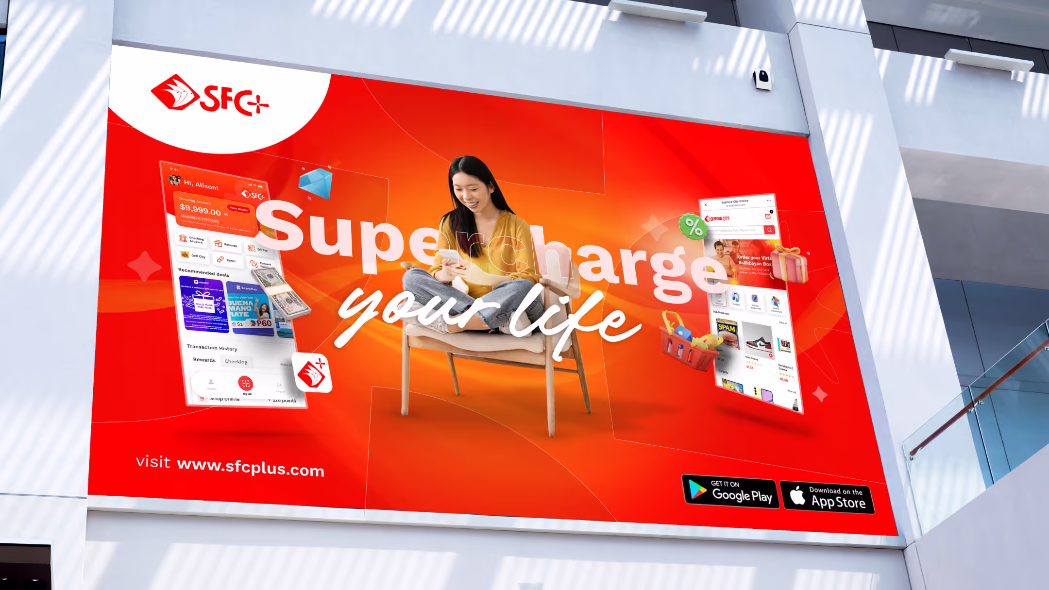
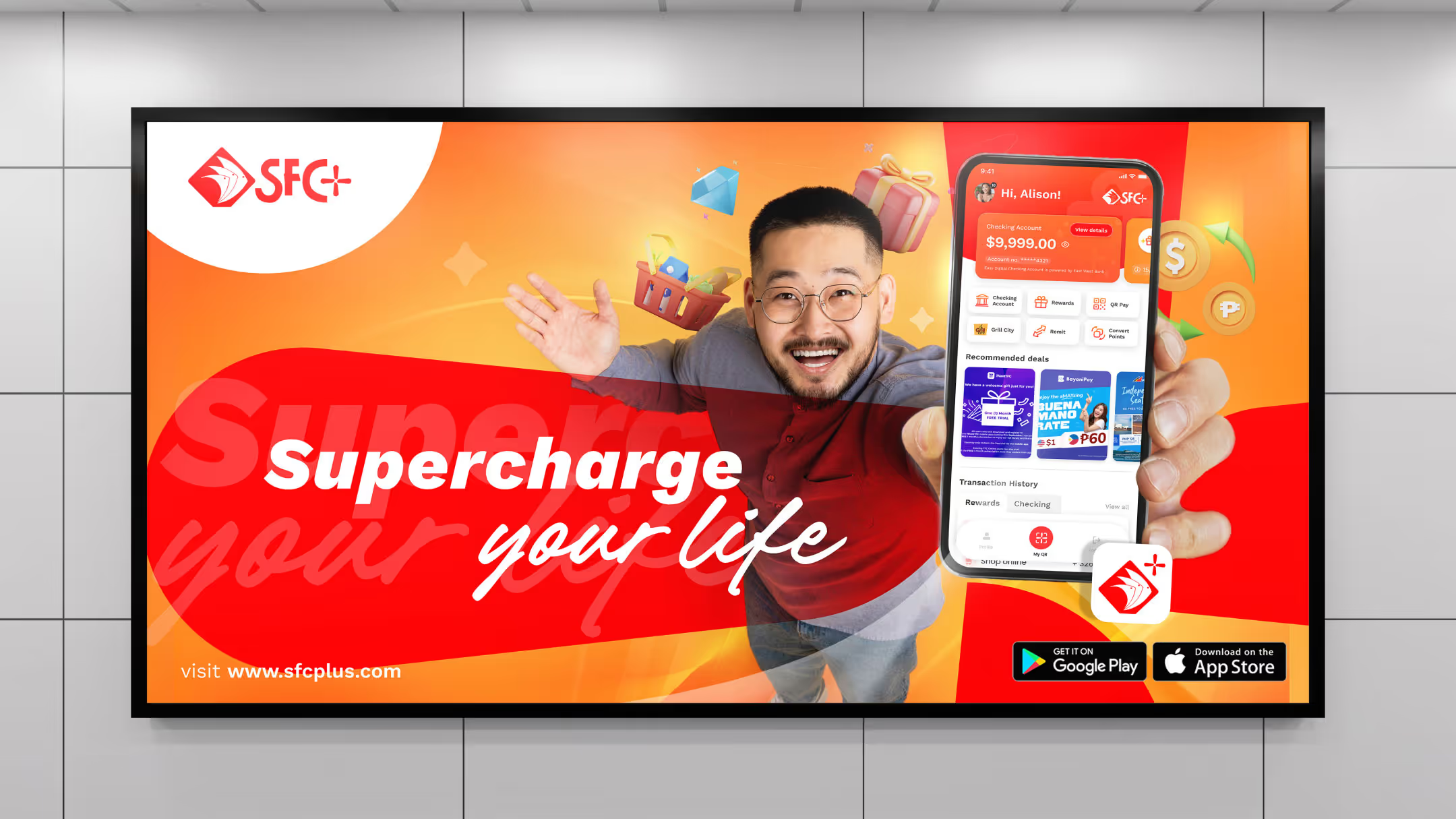
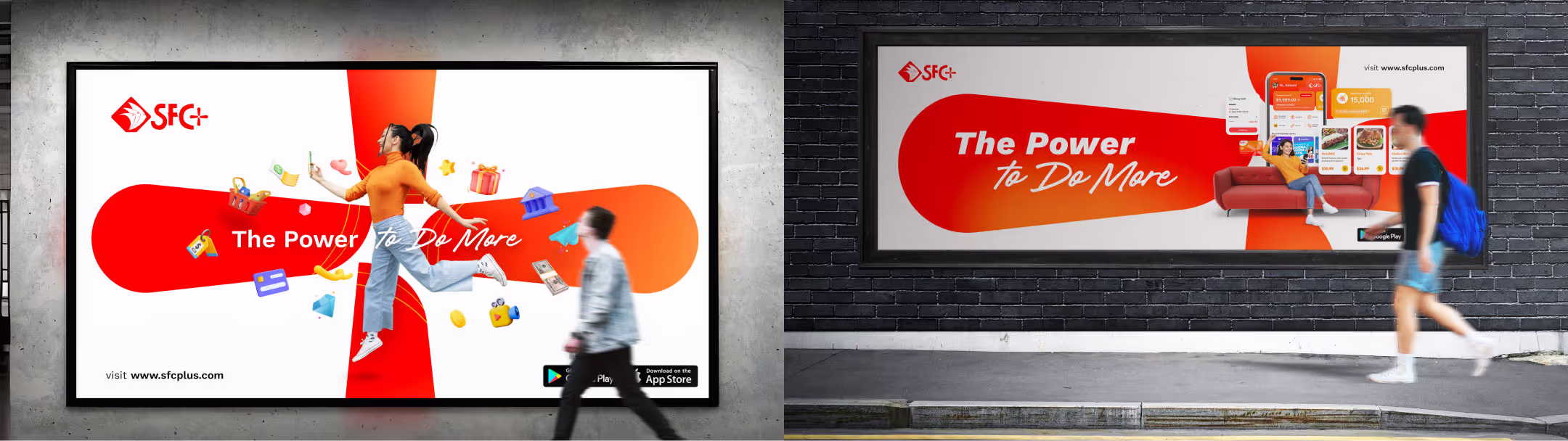
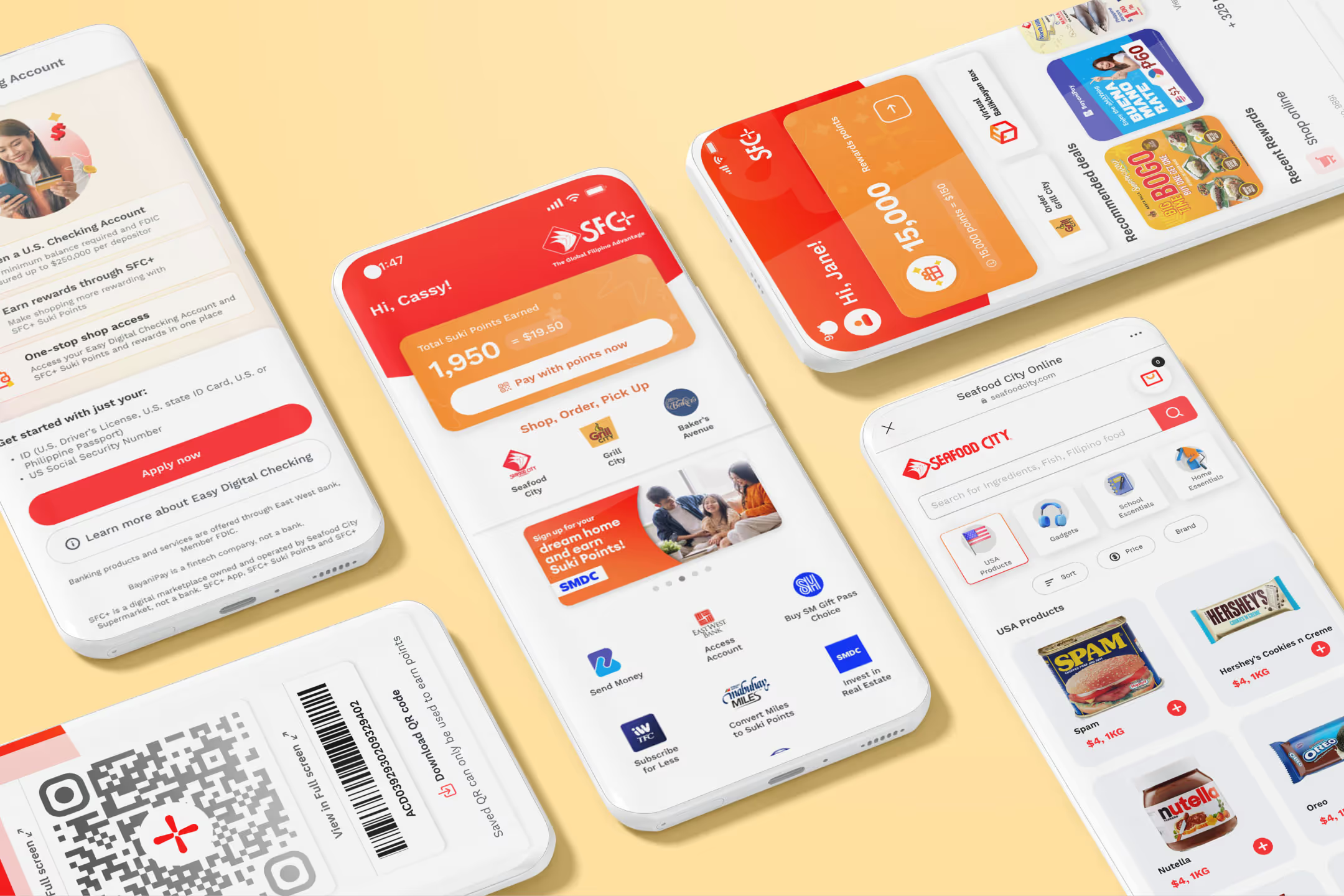
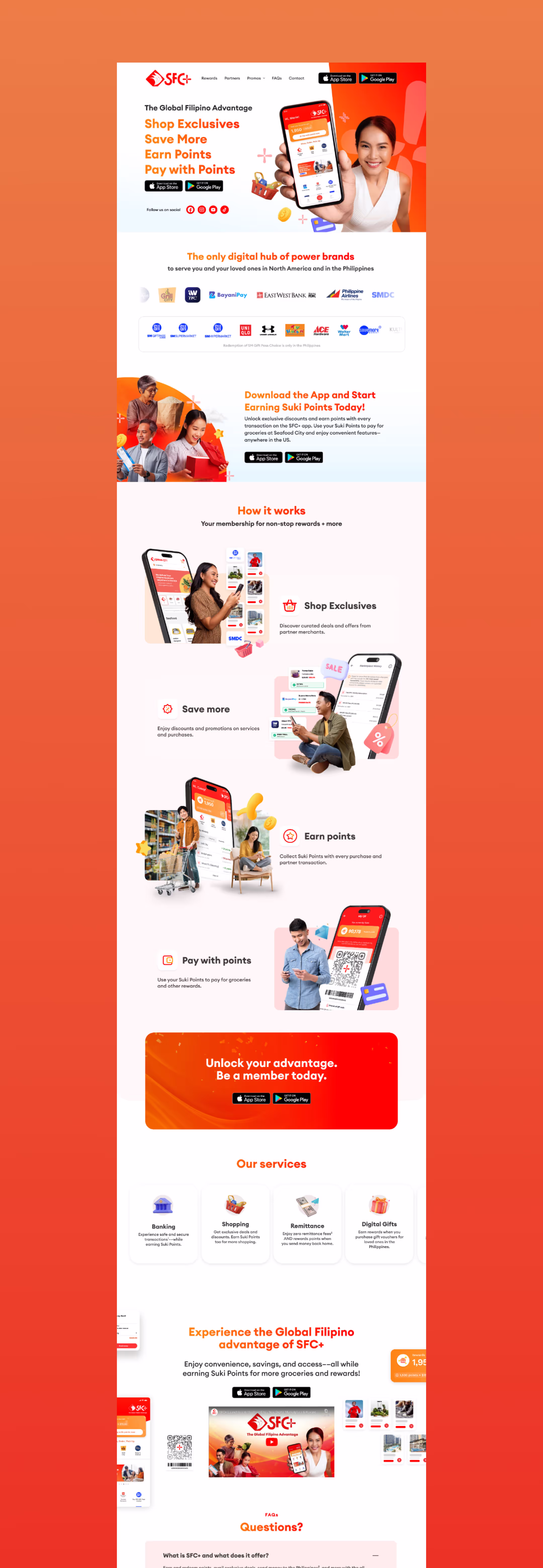
Seafood City, a premier Filipino supermarket chain in the US and Canada, is embarking on a digital transformation to engage younger Filipino audiences. To achieve this, they've launched SFC+, a digital marketplace that offers a seamless shopping experience, loyalty rewards, and exclusive access to popular Filipino brands. Our task is to develop a compelling brand identity for SFC+ that resonates with the target demographic while maintaining alignment with Seafood City's overarching brand. This includes crafting a distinctive brand voice and visual language that captures the essence of Filipino culture and modern convenience.
Branding Idea
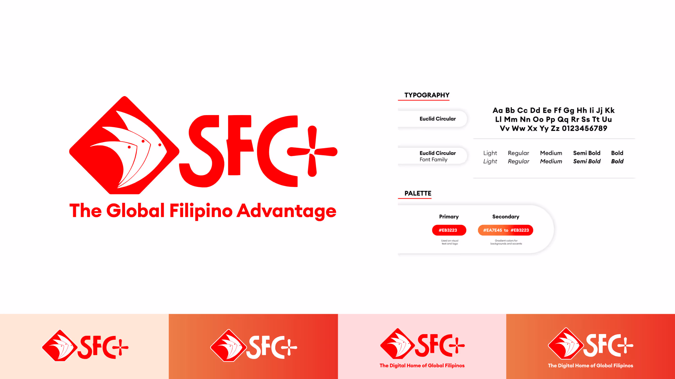
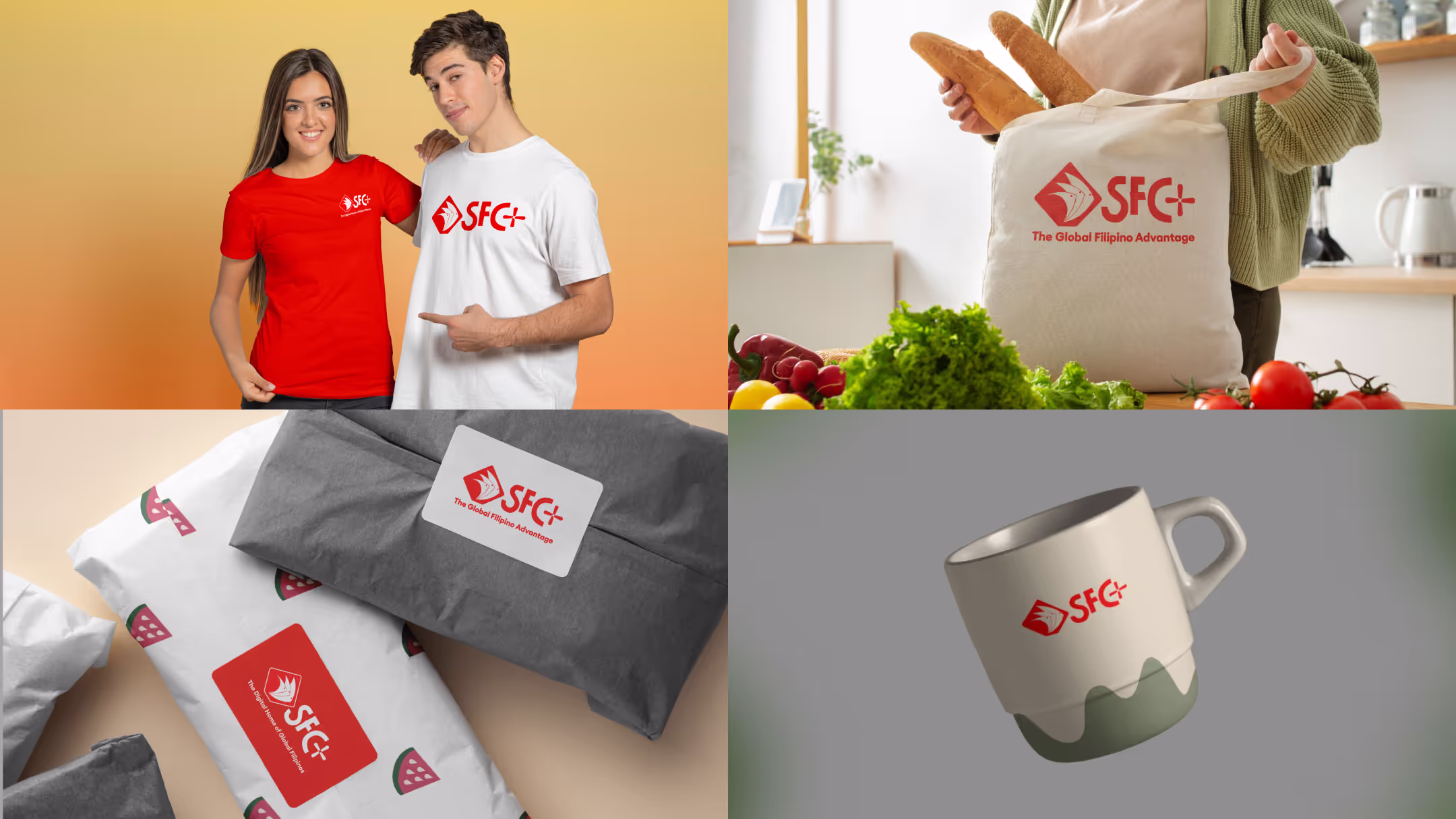
To streamline the brand and emphasize its digital nature, we proposed shortening "Seafood City" to "SFC" and using the "+" symbol as the primary visual identifier for SFC+. This simple yet powerful symbol represented the limitless possibilities and added benefits that the app would offer. By maintaining the core color palette of Seafood City, we ensured brand consistency while signaling a modern and forward-thinking approach.
The "+" symbol would serve as a visual cue for unlocking rewards and exclusive offers. Every time a user interacted with the SFC+ app, they would not just be shopping; they would be unlocking a world of benefits, from exclusive discounts to loyalty points and more. This concept of "unlocking" aligned with the idea of empowerment and progress, making it an ideal theme for the brand.
The "+" symbol would serve as a visual cue for unlocking rewards and exclusive offers. Every time a user interacted with the SFC+ app, they would not just be shopping; they would be unlocking a world of benefits, from exclusive discounts to loyalty points and more. This concept of "unlocking" aligned with the idea of empowerment and progress, making it an ideal theme for the brand.
Other Works
Explore our curated portfolio for diverse industries from Startups, B2B Enterprises to D2C brands